Brand Identity Creation
Overview
Through a perfect blend of primary care and scalable technology Operose Health are experts in working with complex health systems to transform quality of care and patient experiences and help the NHS to achieve their long term plan of giving people more control over their own health and the care they receive.
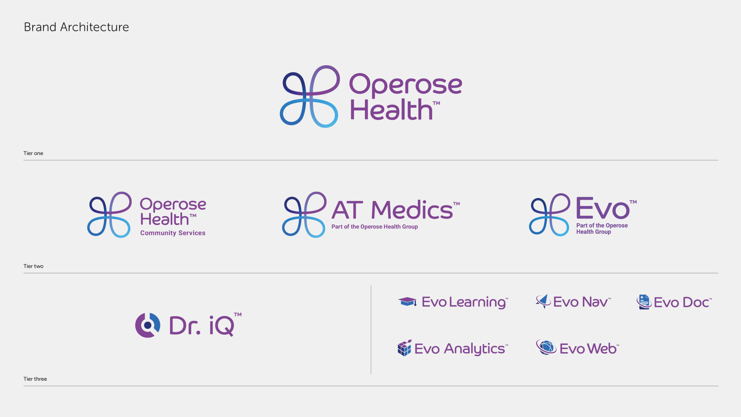
Through acquisitions a fairly complex brand structure existed which needed to be simplified in order to present to the market. This led to us working with Operose Health on the creation of a new visual identity to express a unified new purpose and tie the different businesses together.
Deliverables
Concept
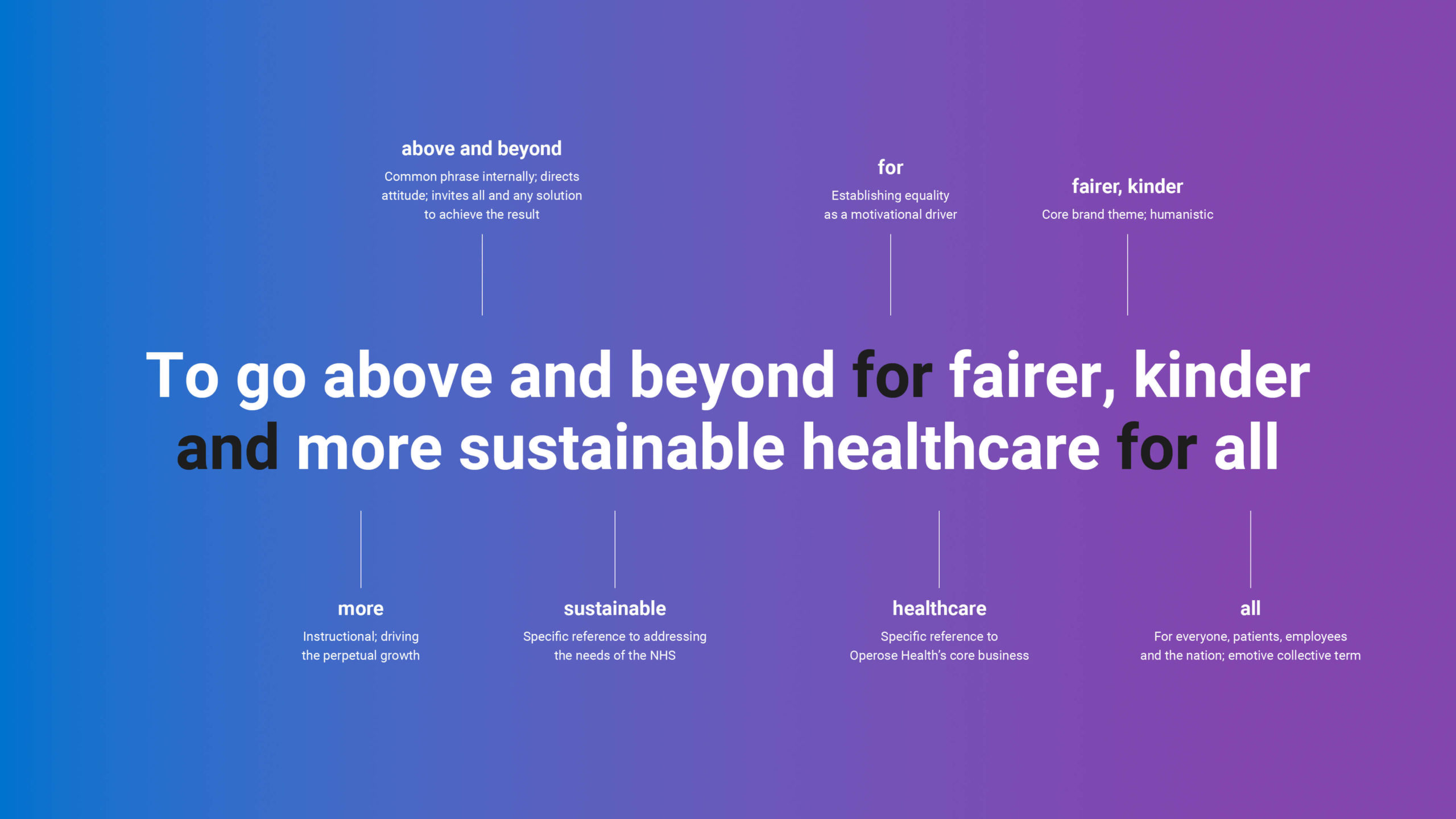
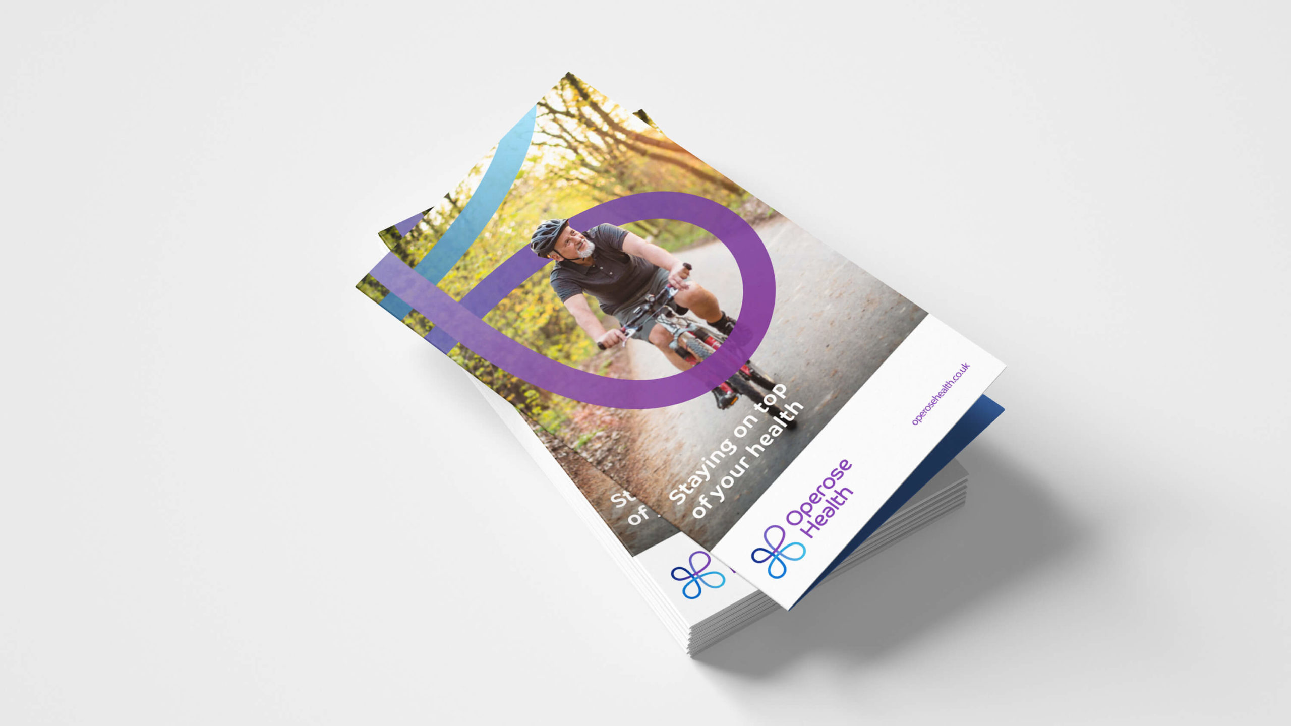
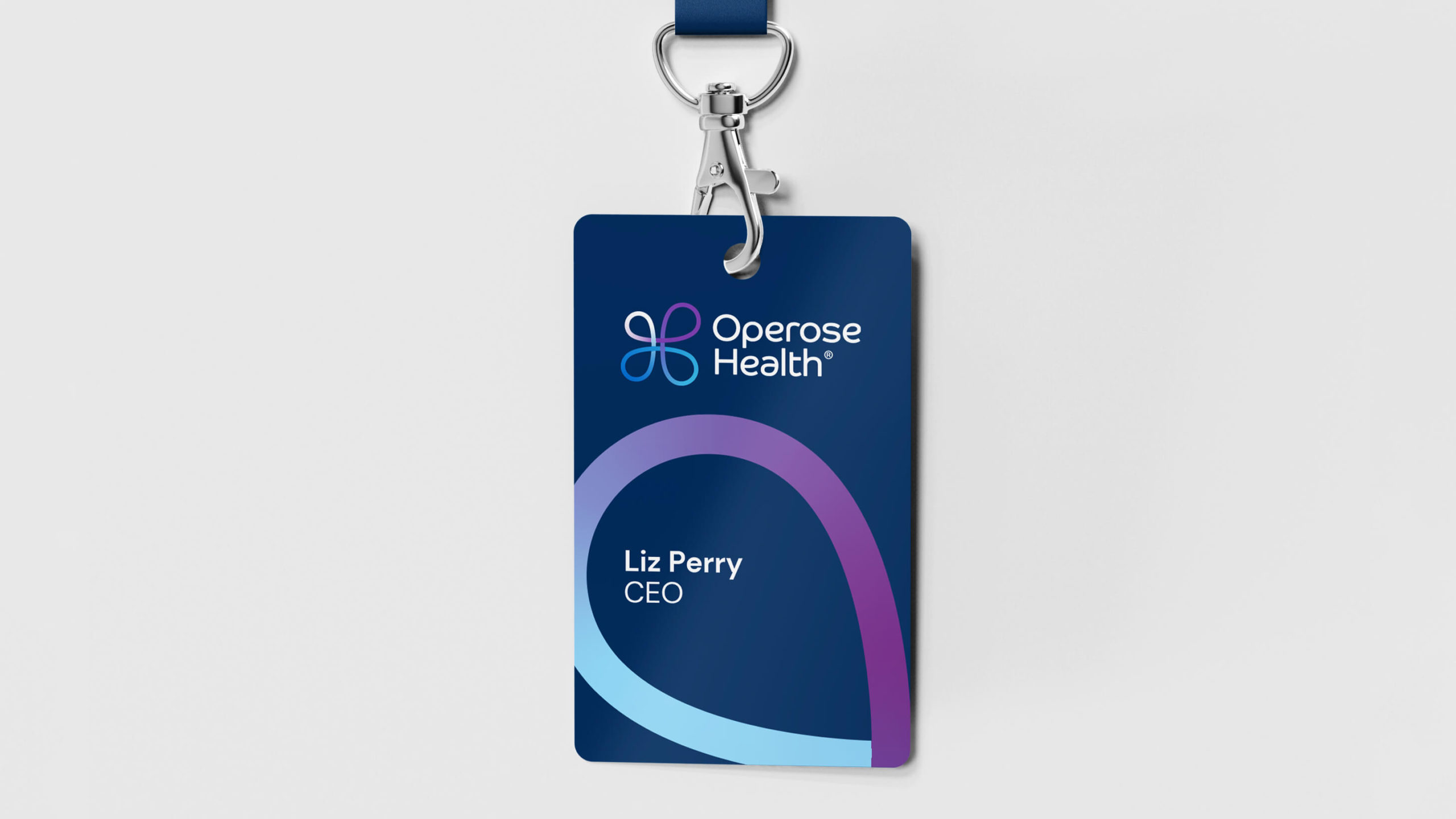
The brand strategy centred around three main themes – going above and beyond, being fair and kind, and creating a healthcare system that benefits everyone. The logo and all visual identity elements were created specifically to portray these ideas.
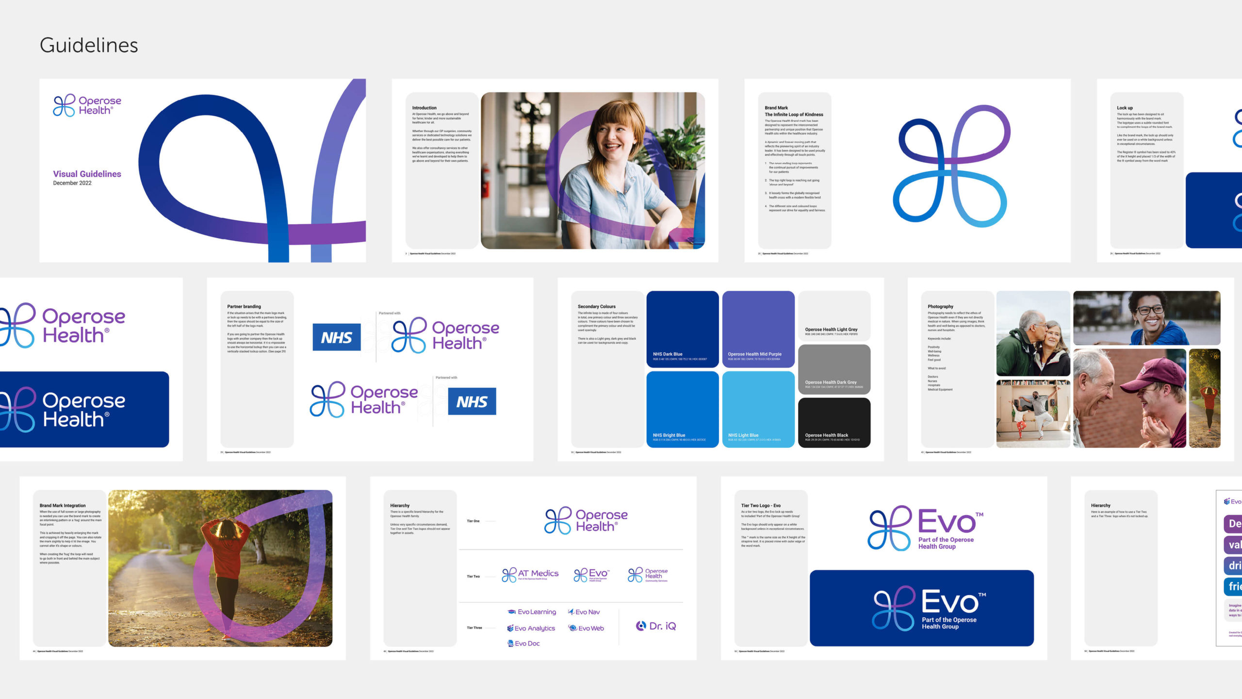
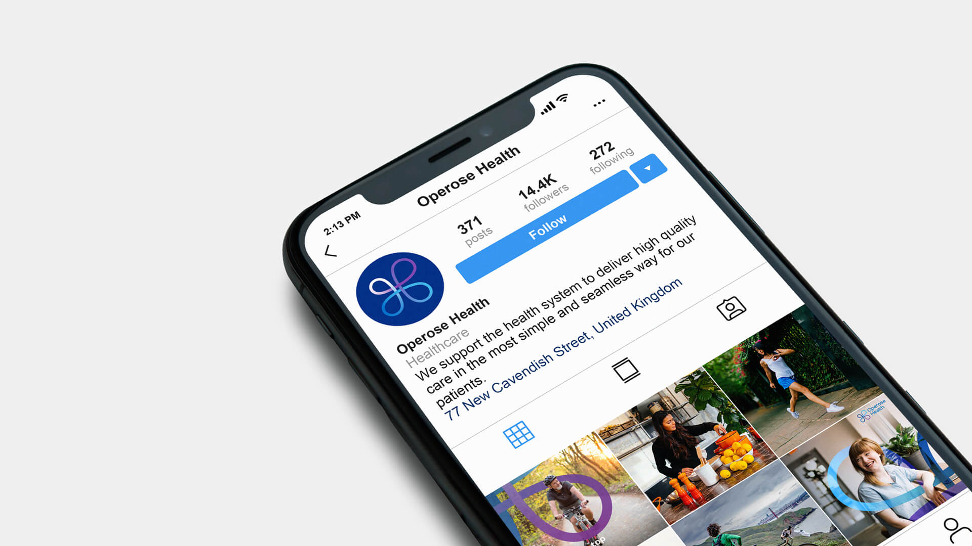
The brand mark takes inspiration from the infinity symbol and alludes to Operose’s continual pursuit of improvement for their patients. The custom logotype uses the same visual style as the brand mark to give an approachable, open and friendly feel.
The colour palette references Operose’s brand heritage and also symbolises healthcare and the NHS.