Brand Development
"A huge and complex rebrand completed with intelligence, care and more than a touch of genius"
Head of Brand - Yolo Group
Overview
Bombay is an exclusive digital and land-based casino for ultra high net worth individuals around the world. It delivers a personalised, extremely high-end VIP experience where users can interact with the same dealers in-person and online.
Using state-of-the-art technology, Bombay gives its users the best possible gaming experience online. They can enjoy authentic, effortless gameplay and single-touch interactivity across a full portfolio of casino games.
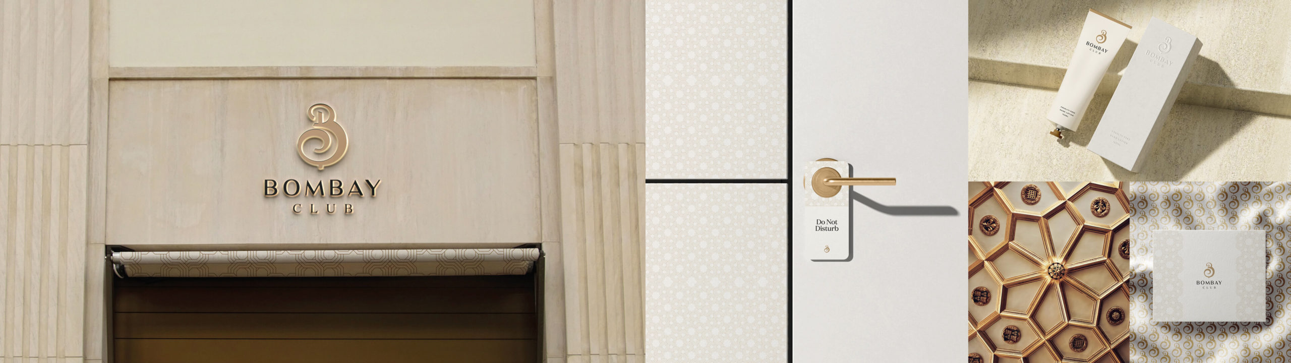
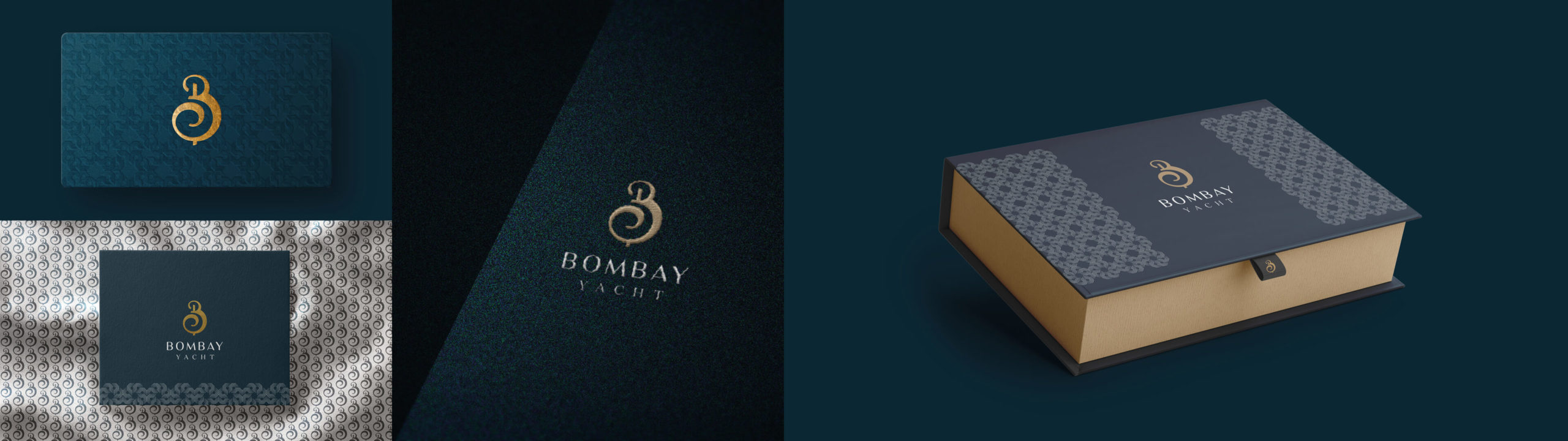
Bombay’s unique offer also includes a physical casino, hotel and yacht, giving their members and guests the ultimate gaming experience.
We worked with Bombay on a brand strategy and a development of their existing visual identity to align all of the different business streams with one vision, but also to give them a suite of tools and assets to make them visually stand apart.
Deliverables
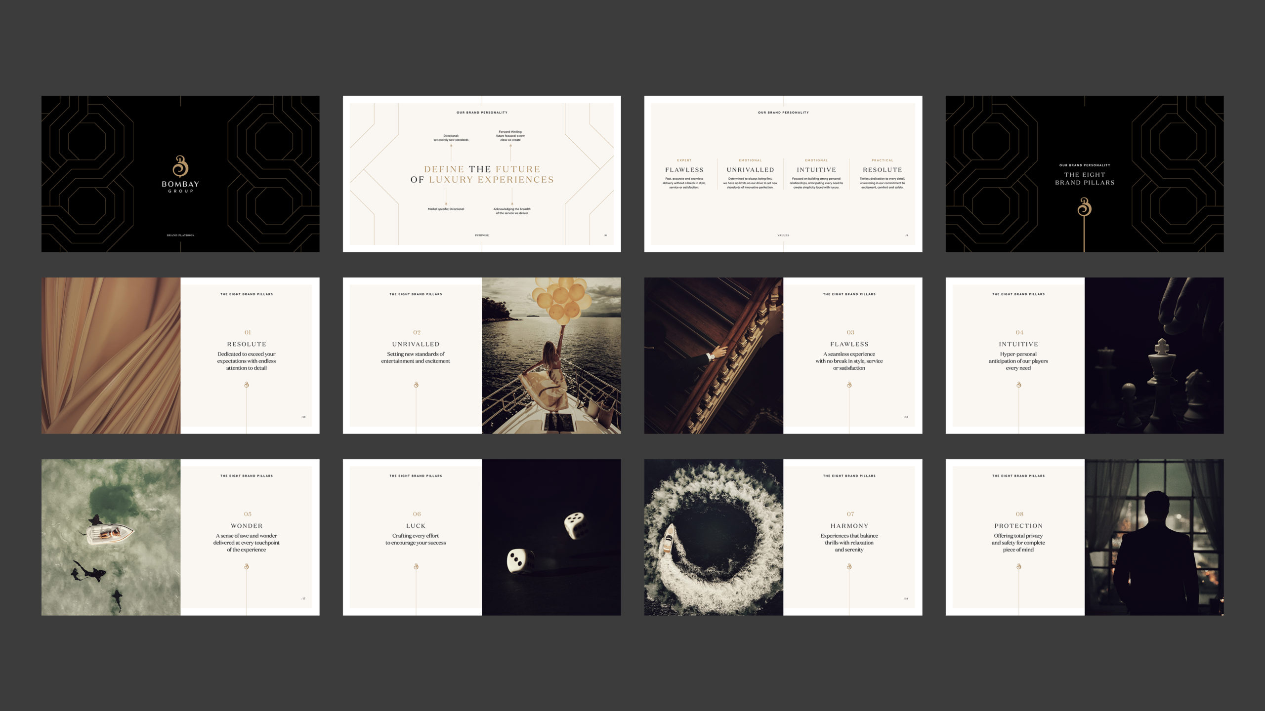
Concept
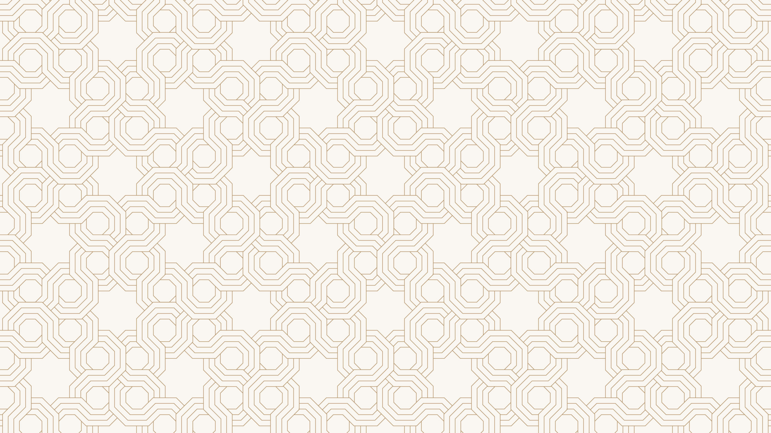
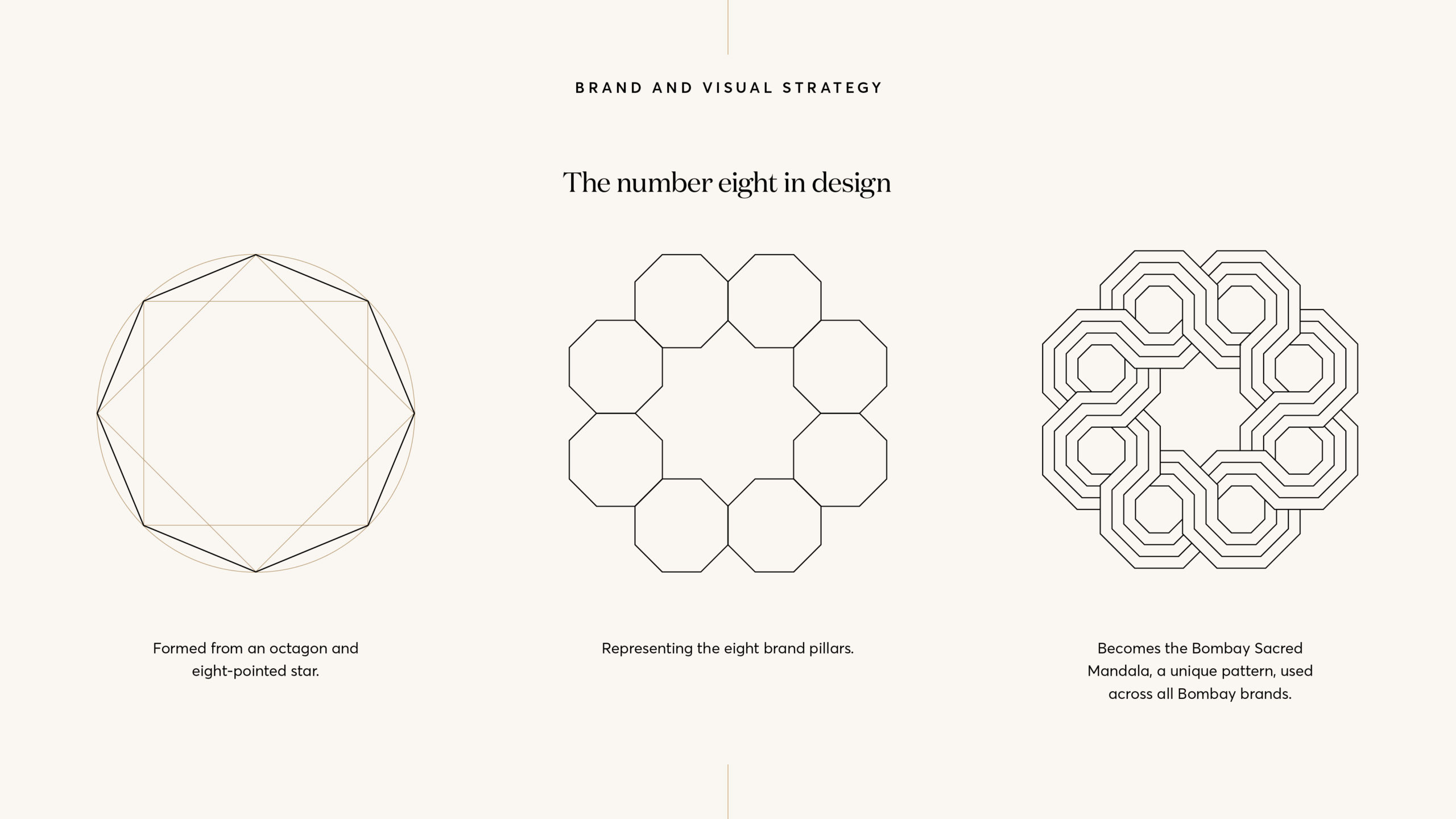
The strategic and visual design system was based around the number eight, which has a variety of significant and symbolic meanings that align perfectly with the Bombay brand.
Eight is a symbol of infinity. It is often related to material wealth, money and success in business and it is linked to universal equilibrium and balance. It is also an auspicious number in Eastern culture.
Execution
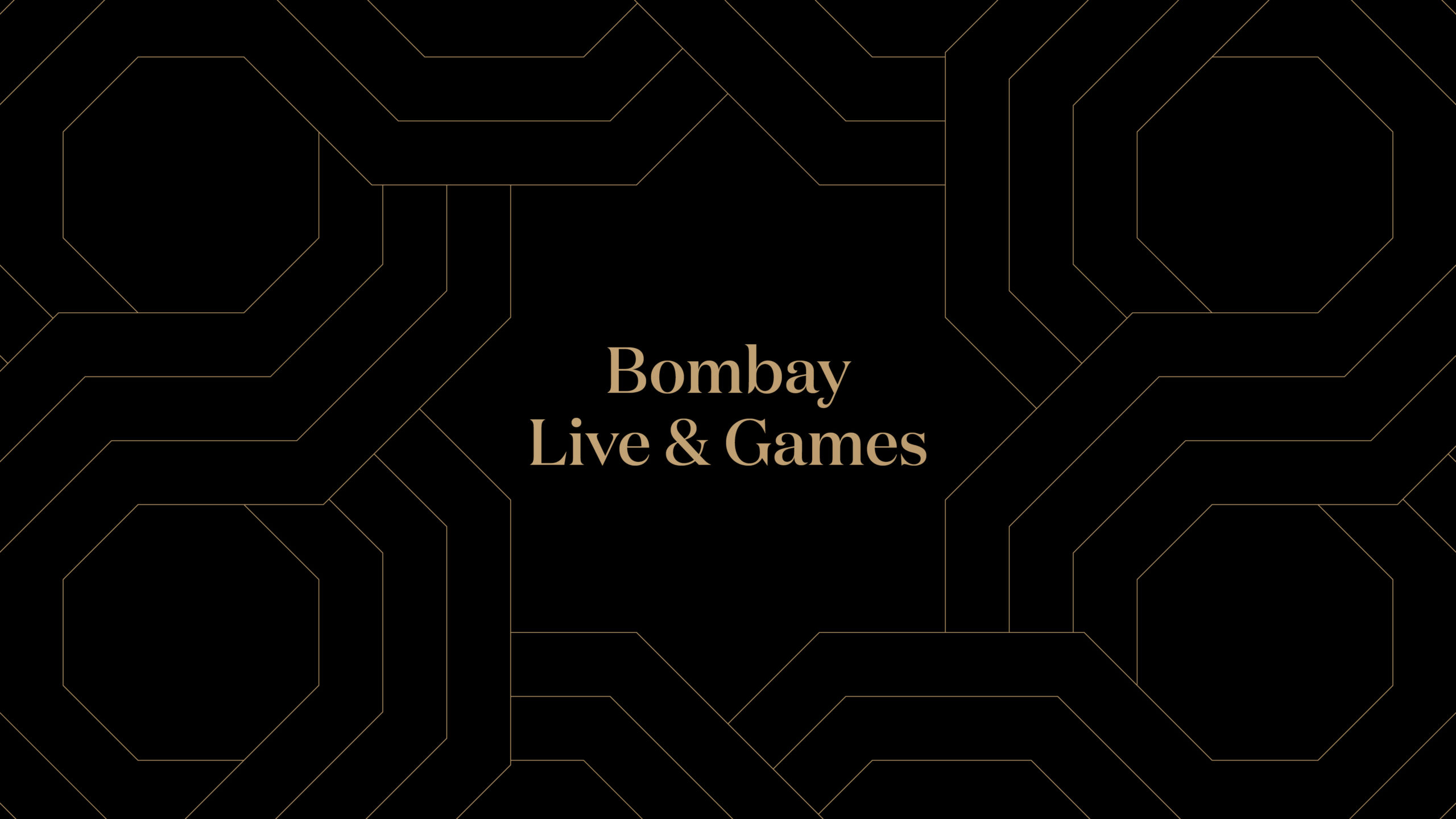
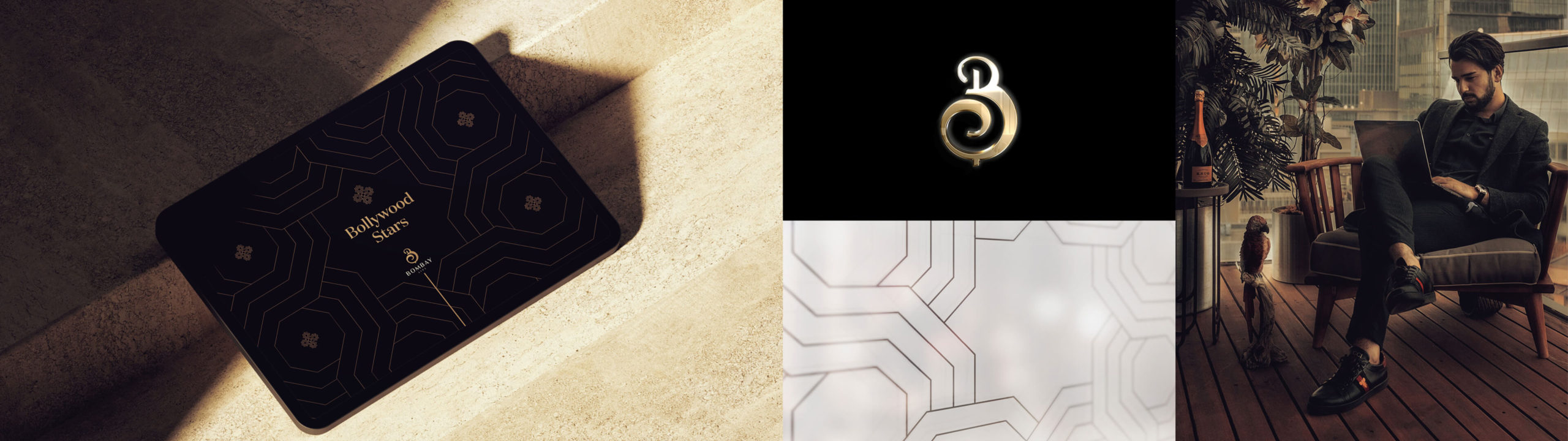
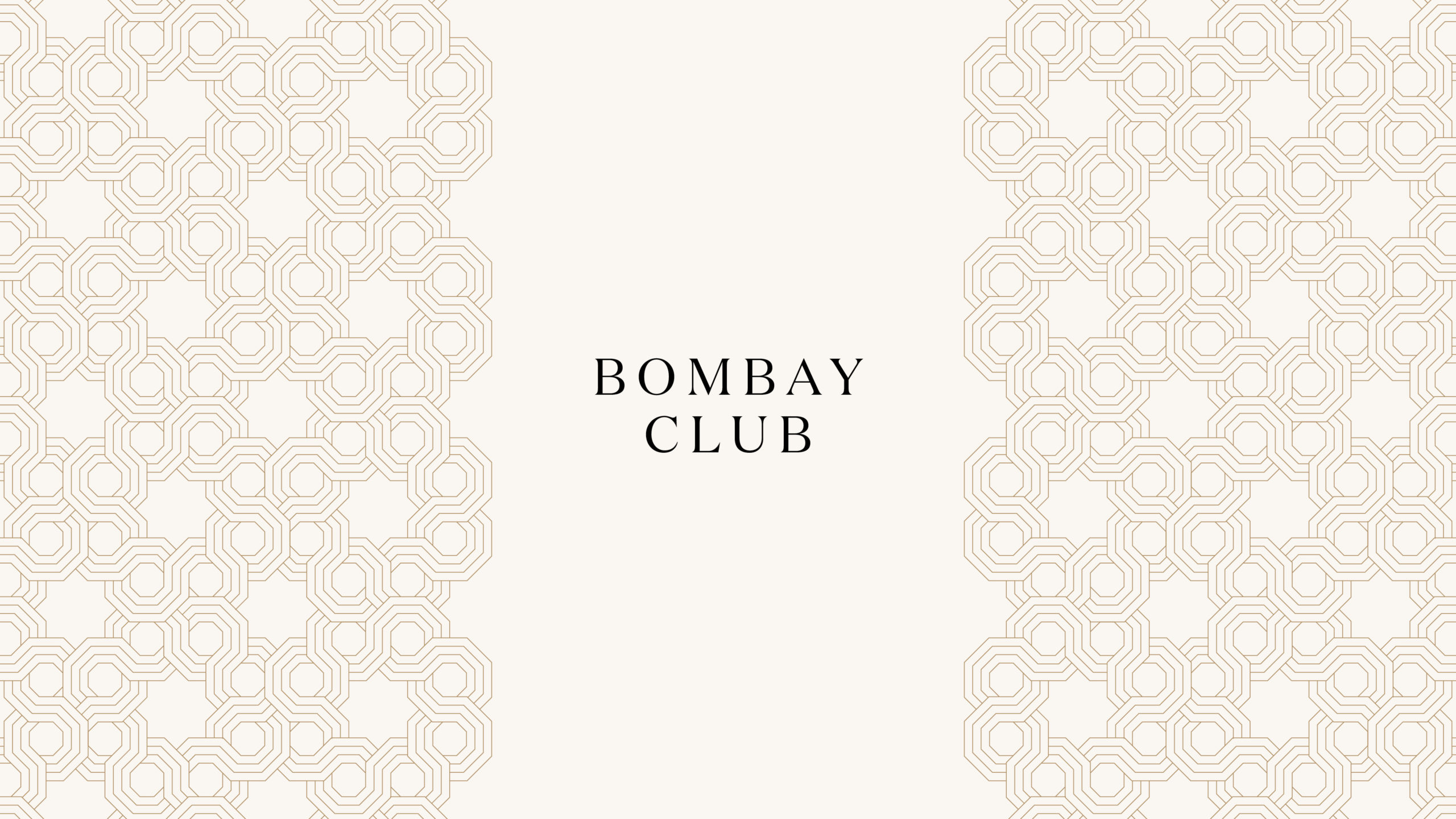
Building on the concept of eight, we used octagons and eight pointed stars as our starting point to create a unique, continuous, mandala inspired pattern that can become Bombay’s signature and used across all of their brands. The continuous pattern is a constant reminder of perpetual change and being ‘always on’, a key principle for a global entertainment brand grounded within the online world.
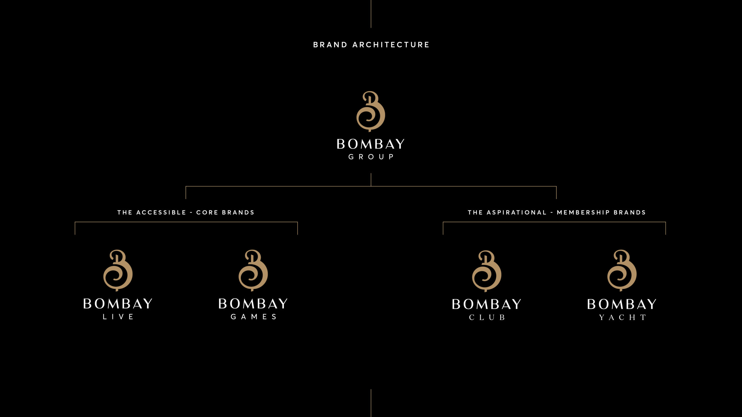
To delineate the different sub brands we gave each a simple brand architecture, with their own distinct look but drawing on the existing masterbrand assets to ensure continuity for anyone interacting with the brand – movement through the brand’s product offerings is intentionally smooth and but subtly different. The sub brands employ different colour palettes but remain tonally similar, and each sub brand explores the mandala pattern in their own unique way.