VerifyLabs.AI
Brand Identity Creation
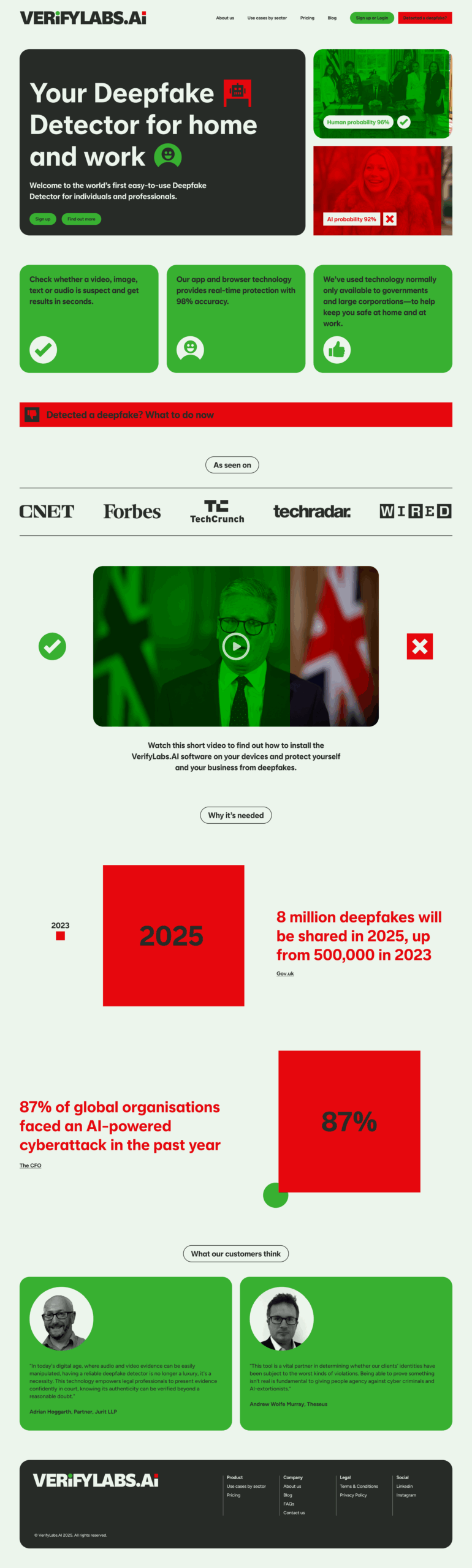
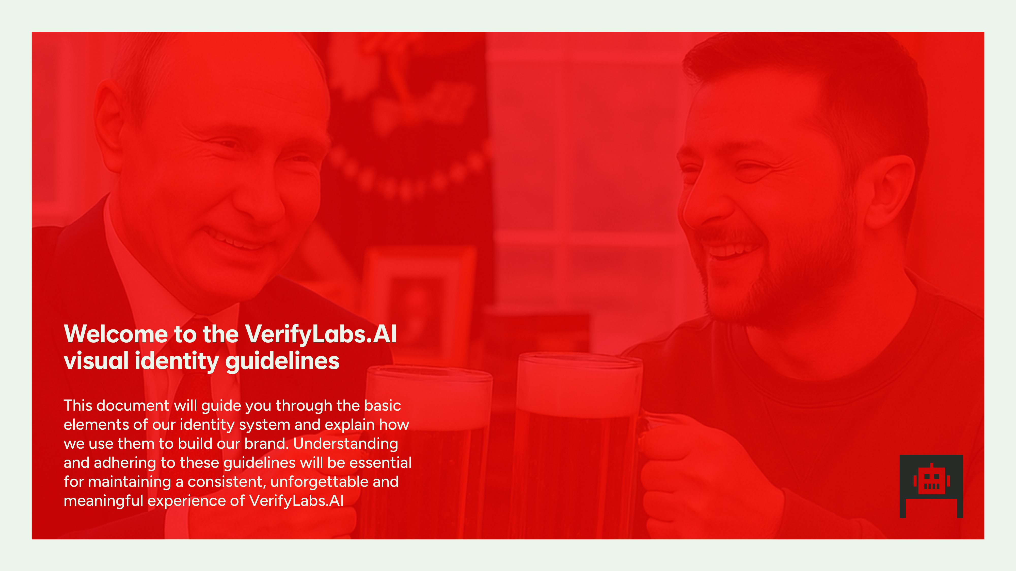
VerifyLabs.AI protects humans at home and at work in the age of AI.
They are the only company offering an easy-to-use tool to help professionals and individuals identify and mitigate AI threats hidden in images, video, audio and text.
Their tool means that for the first time, individuals can take control of their own safety by integrating it into their daily routine. Whether used to help with compliance, ascertain identity or check for fraud, the tool puts the power of deepfake detection into the hands of individuals everywhere.
Deliverables
Brief:
VerifyLabs.AI needed a full visual identity that communicated what it does in the simplest way possible, because, put simply, the key to their product’s uniqueness was its ease of use. Anyone, anywhere can easily check whether something they’ve been sent or anything they’ve seen, heard or read online was created by a human or by a machine.
Execution:
We wanted the VerifyLabs.AI visual identity to be accessible to everyone. It needed to communicate utter simplicity. It needed to explain what it does and how it does it without actually saying it.
The creative breakthrough was a simple realisation: This was a binary brand.
It’s either human-made or machine-made.
A or B.
Yes or No.
There’s no grey area.
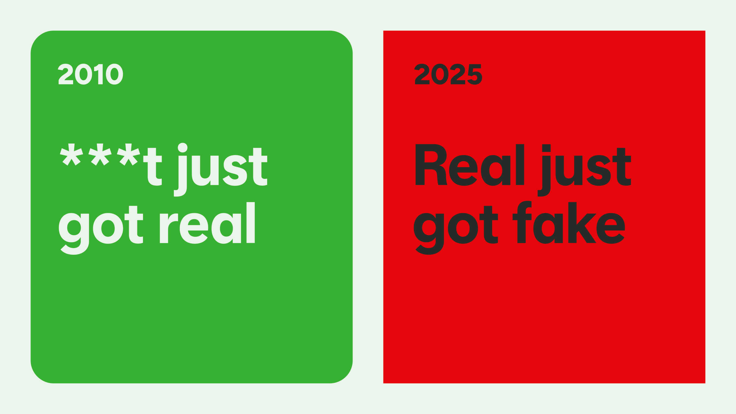
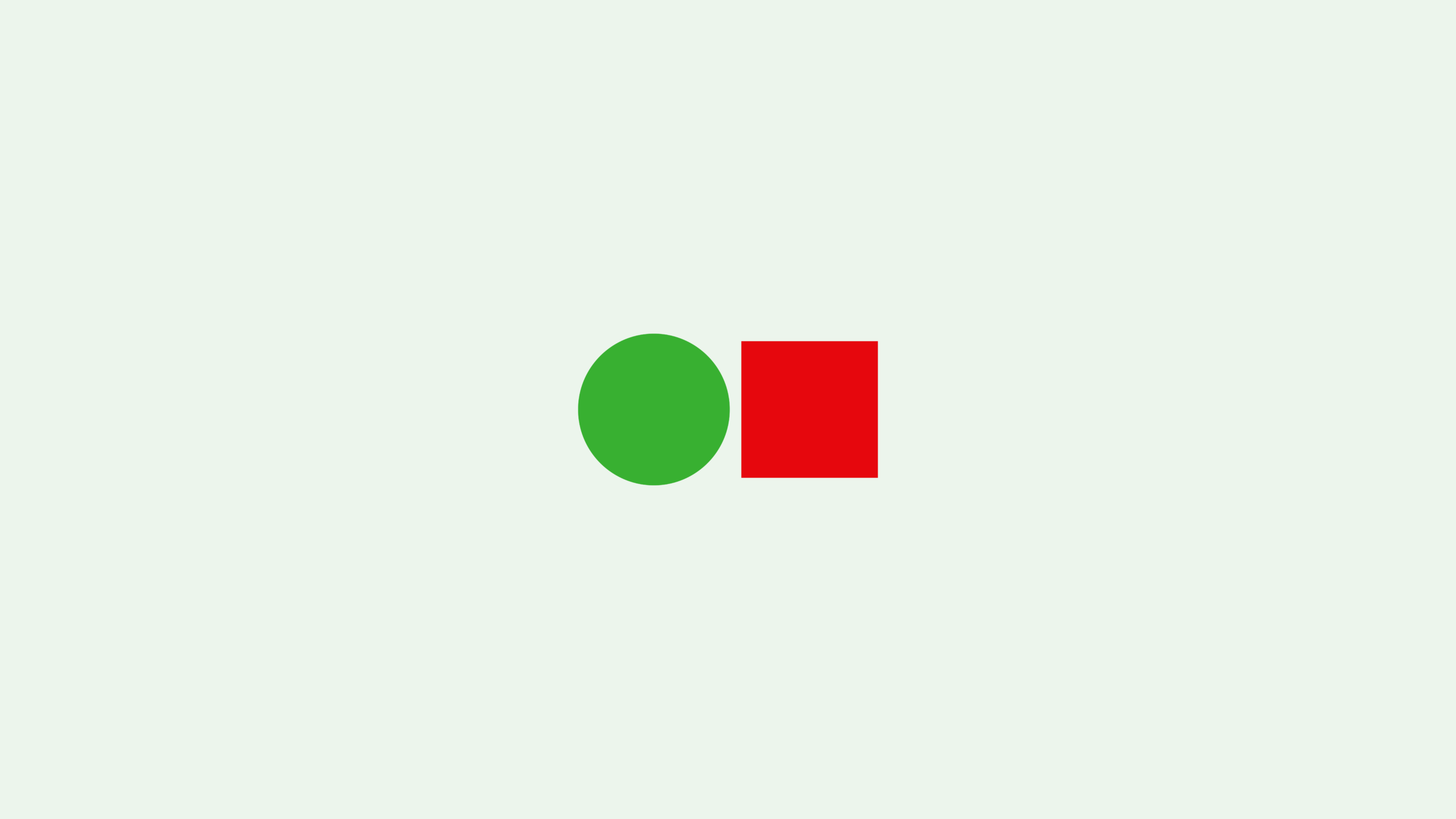
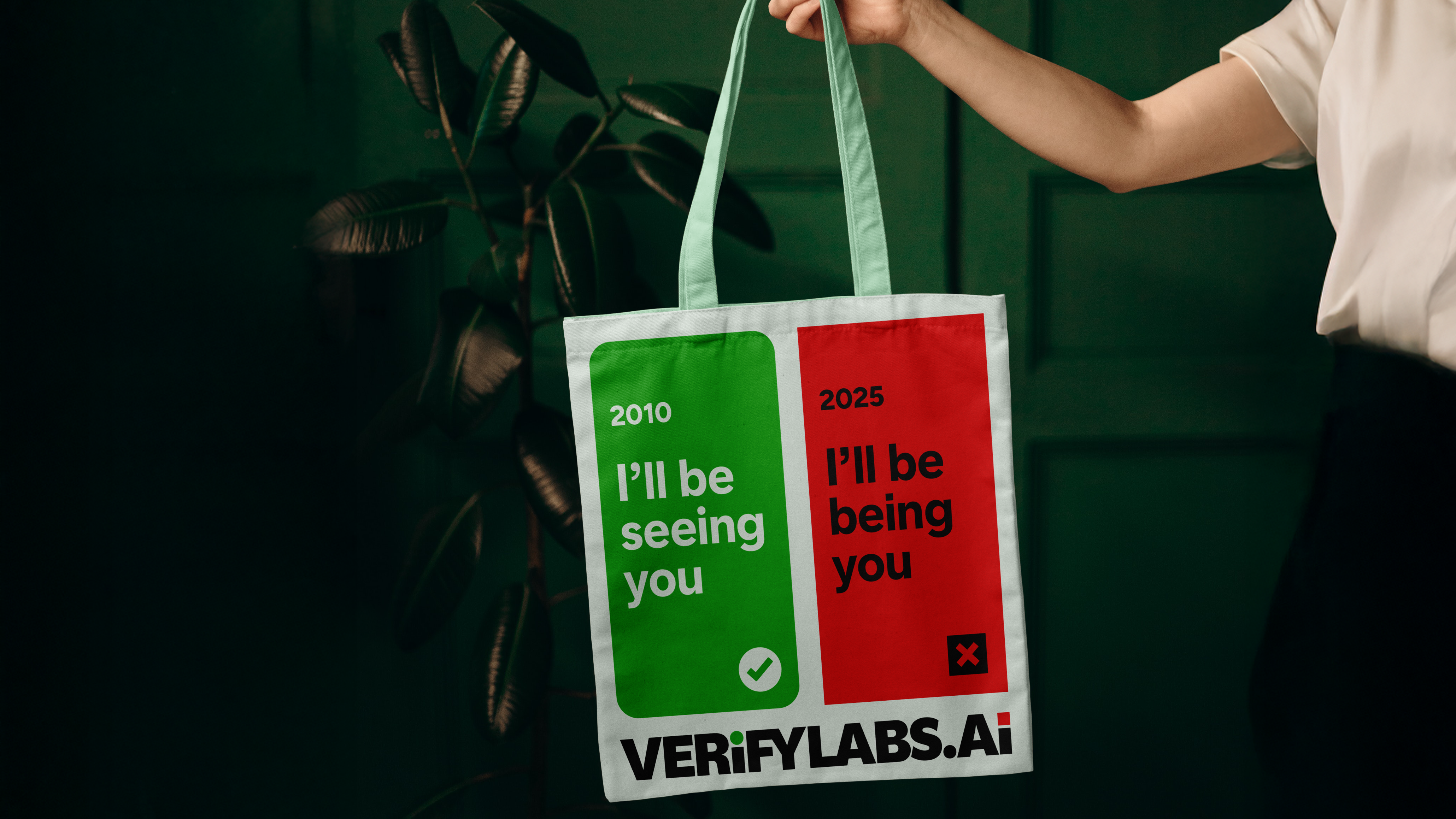
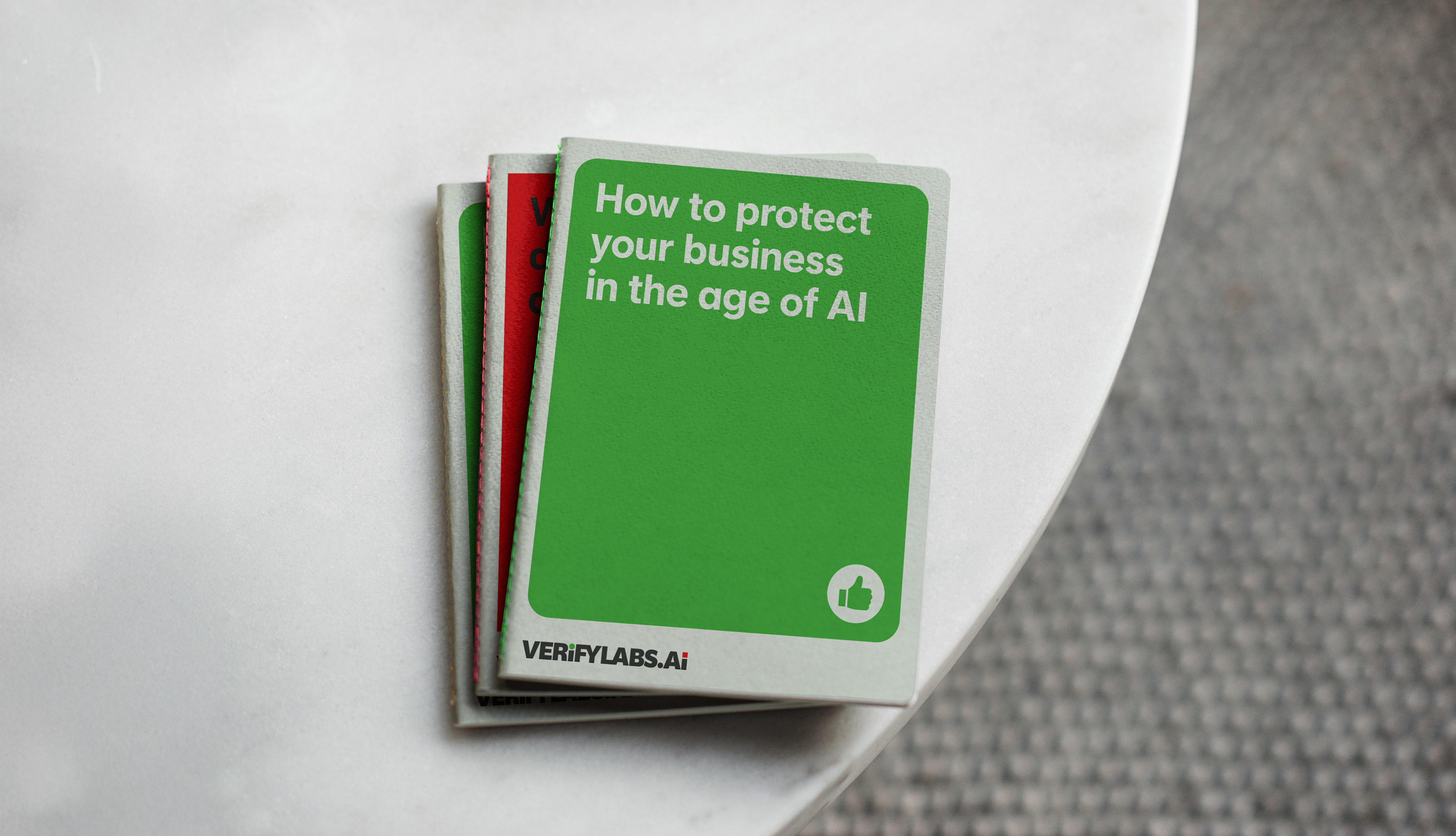
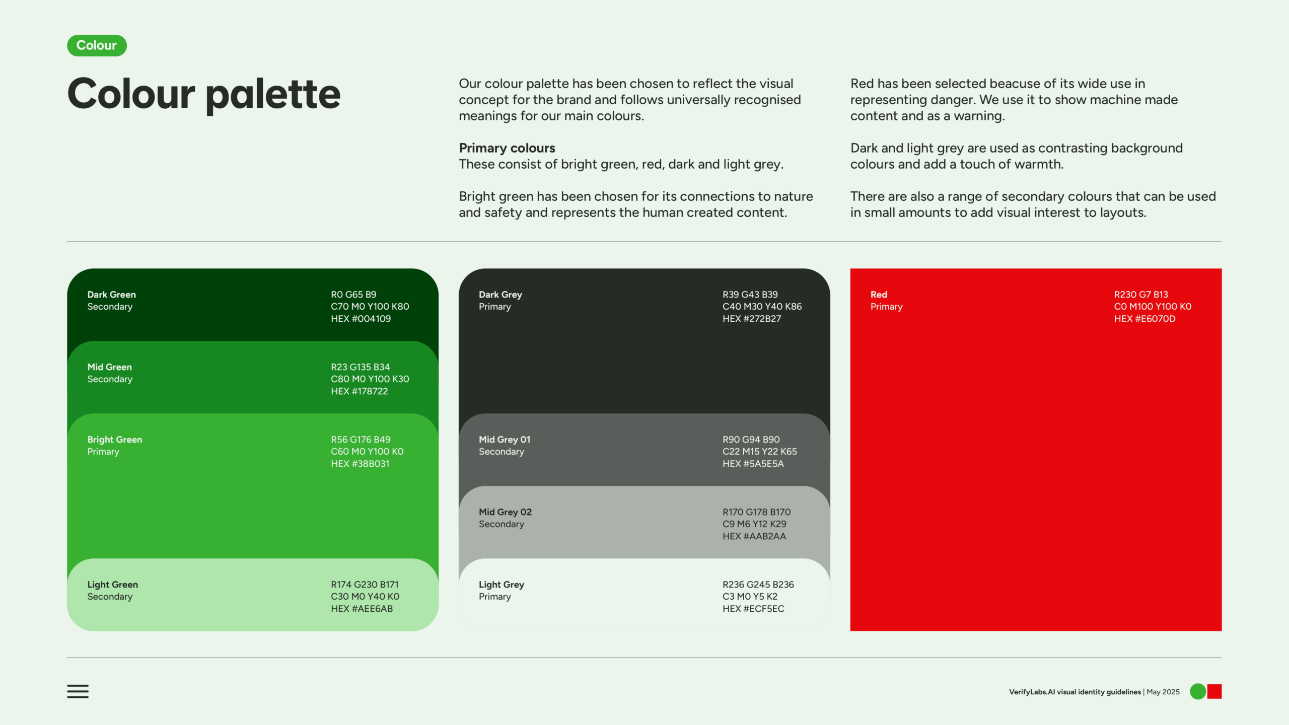
We started with colour. The most basic of colour theory for most of the western world is green means ‘Go’, red means ‘Stop’. This gave us a colour palette that billions would immediately understand. Intentionally contrasting colours to communicate the duality of the brand.
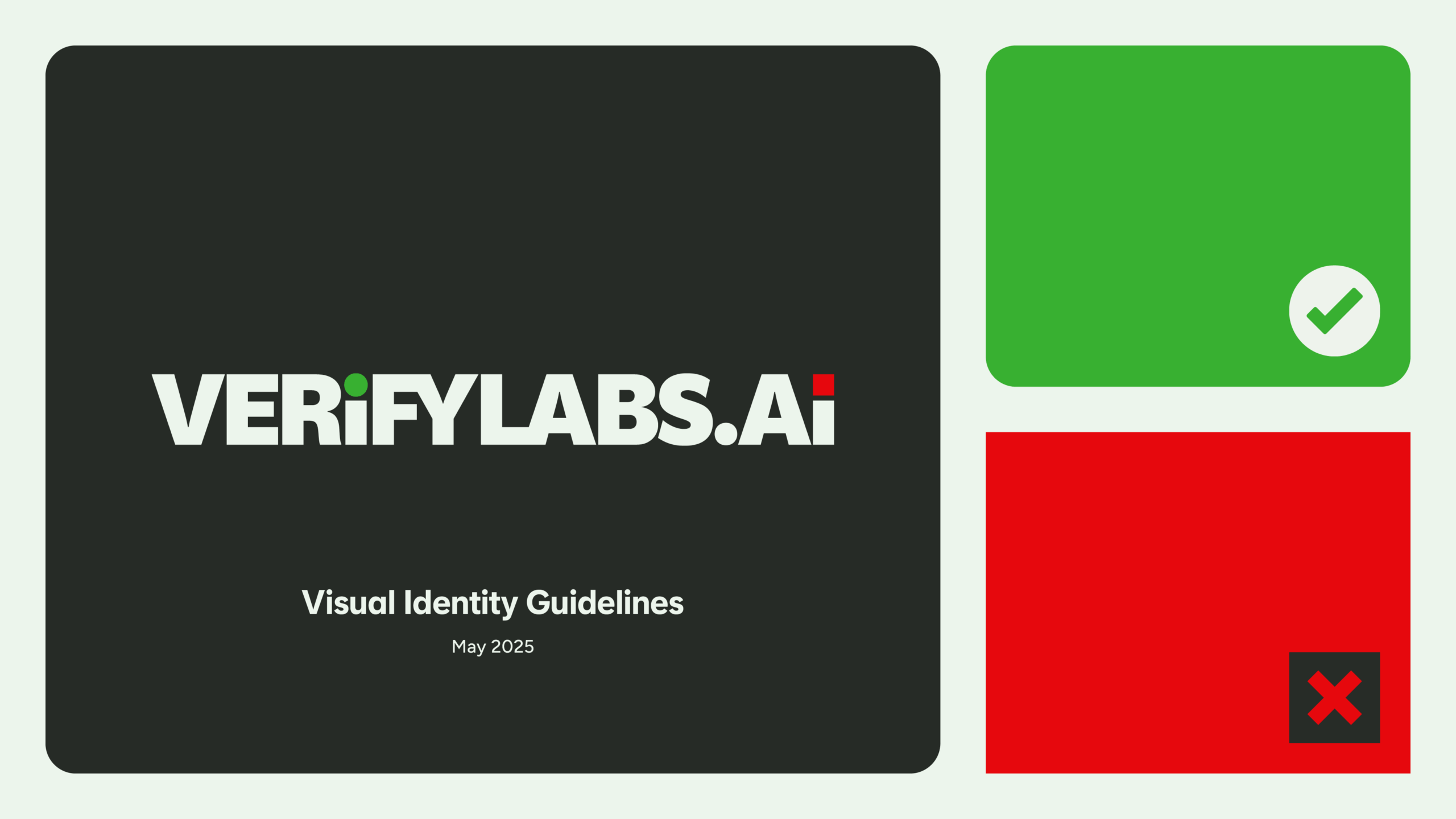
The brand symbol uses two of the most basic, common and recognisable geometric shapes in the world to, incredibly, create a unique, distinctive and descriptive mark for the brand. Total simplicity – completely unique.
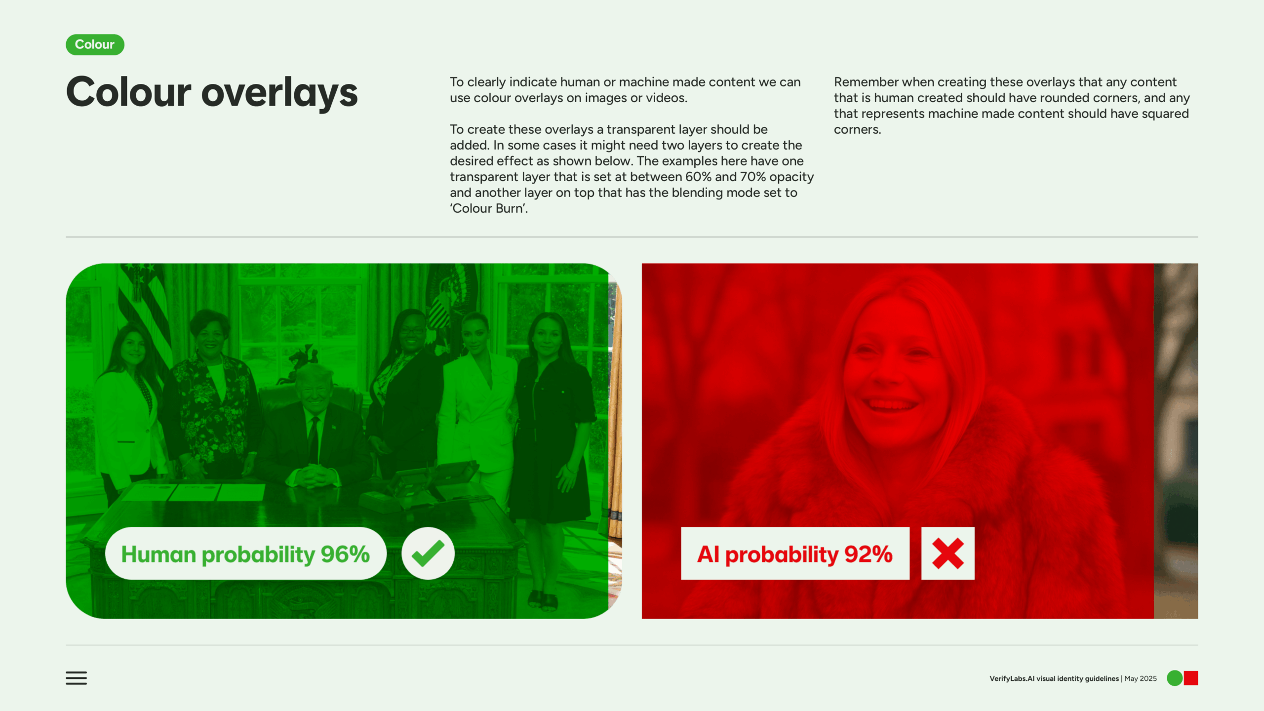
The green circle and the red square are the purest and simplest form of our visual concept that follows through into all assets and communications. Any content that talks about the human experience uses green and circles or has rounded corners, whereas any content that discusses the machine or AI experience uses red and squares or hard cornered rectangles.
Next, the font. We explored the range of humanist fonts, as the company itself – though a tech solution – is borne of real, unique human beings hellbent on helping humans detect AI created content. Using a customised version of Universal Sans, we crafted our own font called VerifyLabs. In fact, we created two – when the message or text being displayed is positive or neutral we use VerifyLabs Rounded. This font has been specifically customised to include rounded dots and punctuation that follow our visual concept.
When the message is negative or about AI made content we use VerifyLabs Squared, which has been given squared dots and punctuation. This further cements the simple visual ying and yang of the brand essence, in a subtle but consistent way.
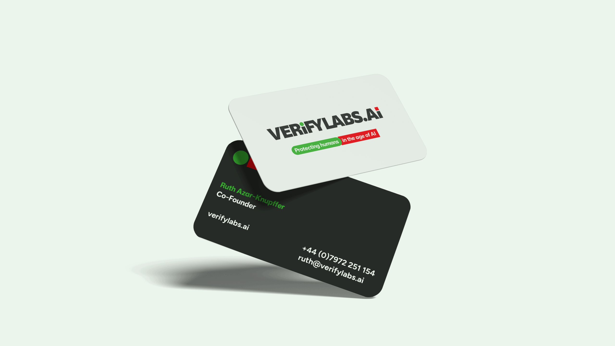
This font is the basis for our wordmark, but with the inclusion of two unique touches that communicates the opposing forces of deepfake content – human vs machine.
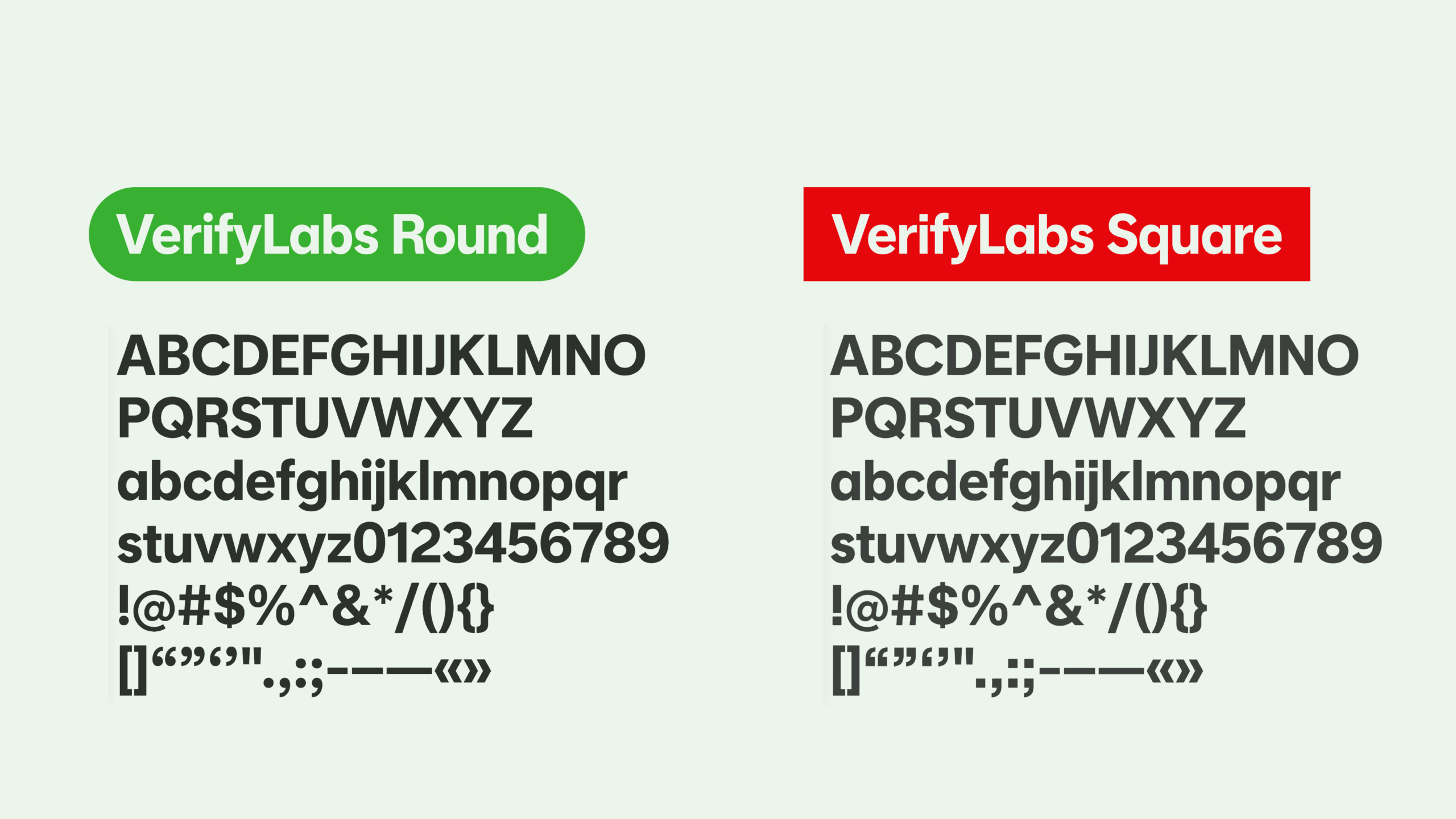
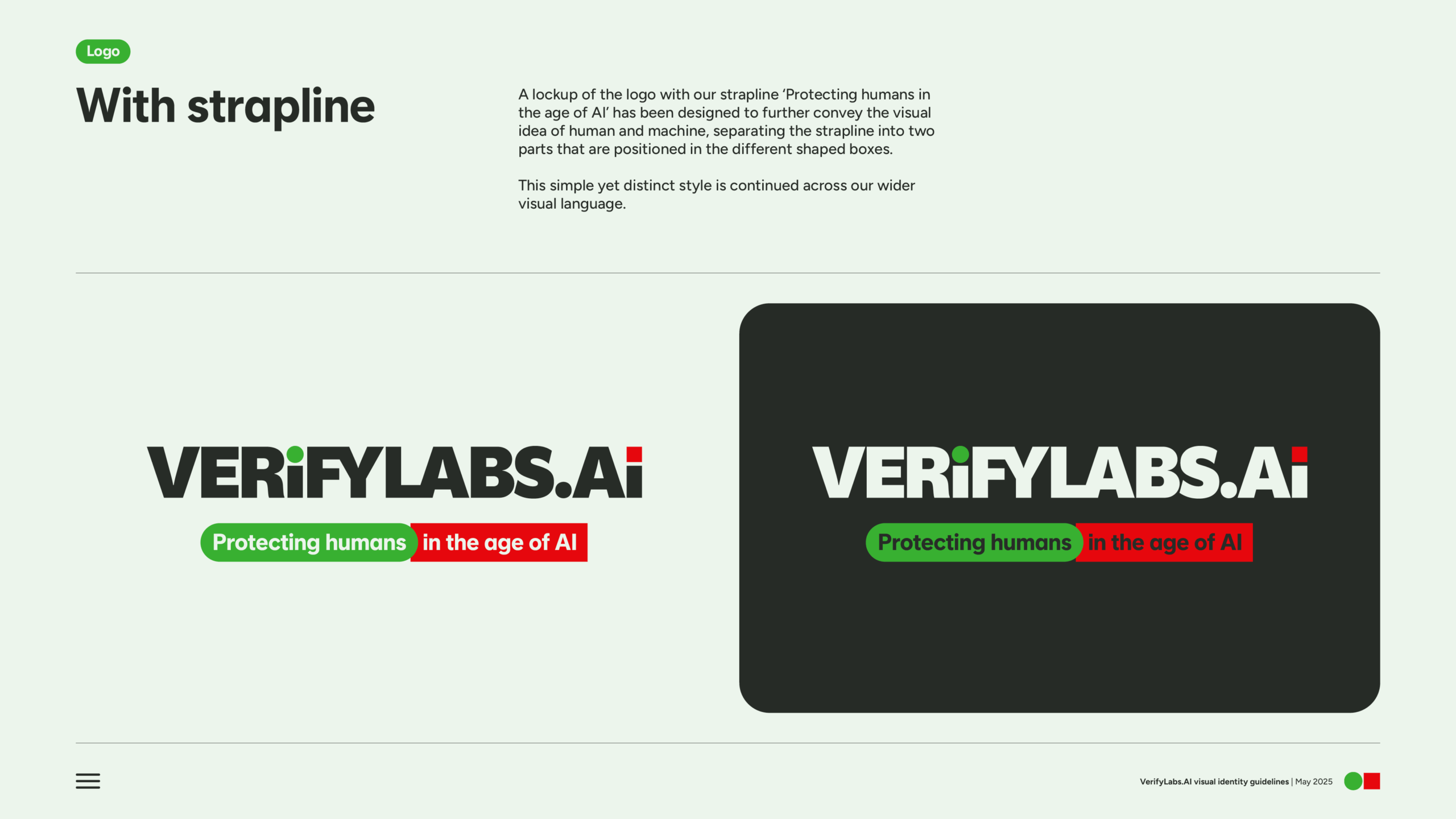
The green, circular dot of the ‘i’ portrays the human side and the red, square dot the AI side. The same two elements of the symbol, separated and put to work within the wordmark itself. This distils the complex nature of deepfake content into an extremely simple and clear visual language with universal recognition.
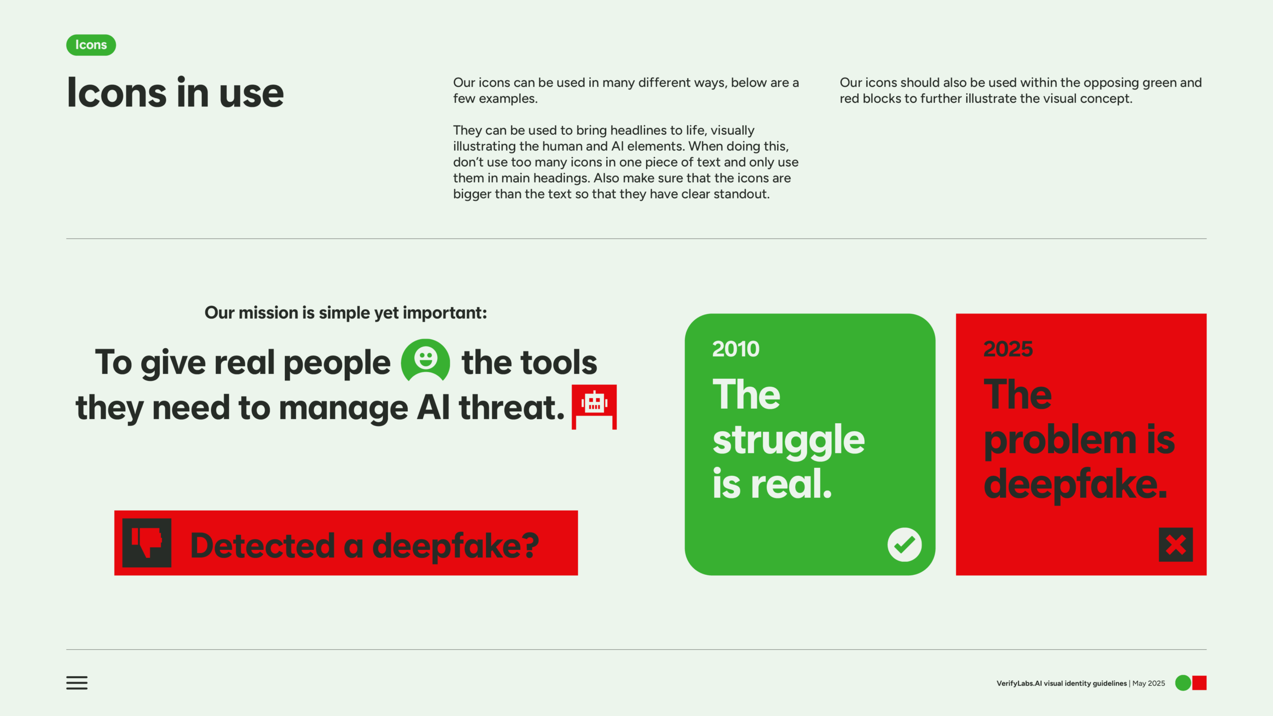
The green circle / red square theme continues throughout the identity, constantly reinforcing the central message in the suite of icons and the layout design system.