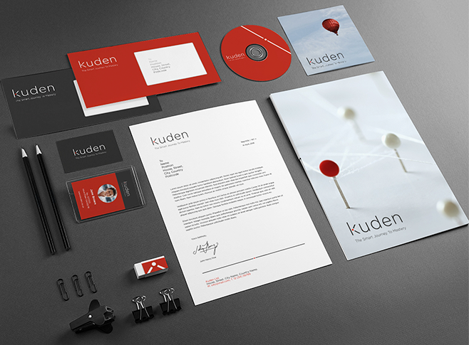
B&D rebrands management consultant Kuden

We overhauled management consultant Kuden’s branding to help the company communicate a powerful and innovate identity.
Kuden asked us to create a new look-and-feel for the company and was eager to attract the attention of key decision makers as well as communicating a strong trust message to people who’ll require the company’s services.
Our brief was to ‘cut through the noise’ and make this busy, highly discerning audience sit up and take notice of the services that Kuden has to offer. Naturally the work needed to appear professional but Kuden wanted to avoid being cold or clinical, and asked us to make the brand feel ‘human’ and approachable.
We created a brand centred around a the journey a user takes with Kuden. We built a logo with a Kuden’s “K”, with a central rod dot symbolising the start of the journey to mastery. The dot and the surrounding space then transforms the K letter lines into route lines.
Kuden’s imagery is minimal, abstract, and modern. It uses pops of colour to bring key objects to your attention and uses subtle subdued tones overall. The iconography focuses on simplicity, professionalism and consistency.
Brand & Deliver is employed by a number of leading technology companies to develop their brands and product marketing.
