Radeon Rebranding & Launch Campaign
Campaign Results


22 Awards Including


The overview.
Tech giant AMD asked us to rebrand its computer graphics arm, Radeon, ahead of the launch of its newest product, the RX 480 graphics card. Although the computer chip manufacturer turned over $4.27 billion in the previous year, its market share was slipping, as was its own value on Wall St.
Deliverables
The campaign.
We saw the rebrand and the launch as intrinsically linked, rather than two separate campaigns, with Radeon’s new identity informing a refreshed marketing strategy. At its core, was the construction of an ongoing narrative that would transcend specific product cycles and business deadlines, and instead take the consumer on an ever-evolving journey.
Embracing brand values.
It was vital we leveraged Radeon’s culture and emphasised its own identity in the branding we created for them. We dispensed from aping its competitor’s masculine approach to marketing and embraced Radeon’s interconnected and engaged community and its open approach.
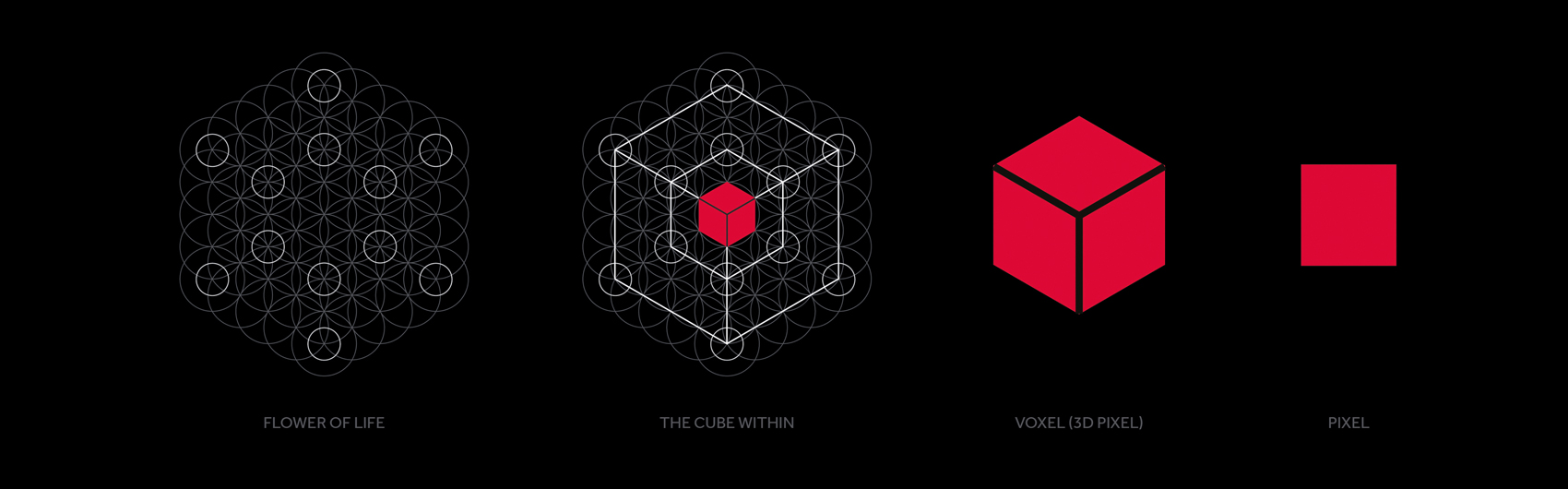
There is a geometric pattern known as the Flower of Life, which underpins a variety of structures and shapes found in the natural world. The pattern is shared freely, echoing the way Radeon is open with its software.
At the centre of the Flower of Life is a perfect cube. In computer graphics, every image is made up of thousands of tiny cubes called pixels or voxels. Where the Flower of Life is nature’s building block, the pixel is the digital equivalent. This became the heart of our creative direction.
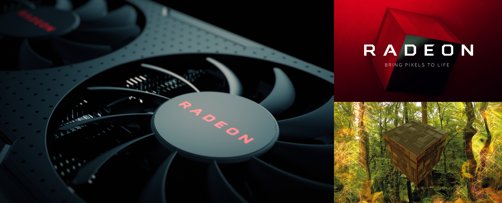
Bringing pixels to life.
The pixel became our building block and informed the characters found within the logo, the monogram, product nomenclature as well as image art direction.
We created a clean and striking logo based on a brand identity that appeals to a community that values collaboration and transparency. No longer is Radeon the second choice brand, it now communicates its position as the company at the heart of a community of enthusiasts. We did this by utilising bold colour choices, edge-to-edge imagery, large scale typography and lots of intentional white space. It’s cleaner, less fussy and – as patterns in nature build and iterate on the Flower of Life – Radeon can build on its pixel logo, using it as a base to revive its fortunes, both figuratively and literally.
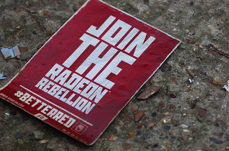
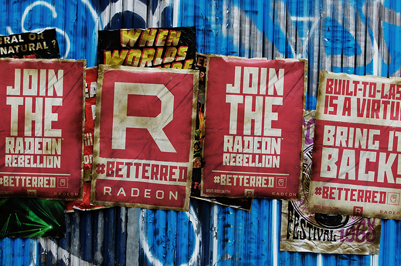
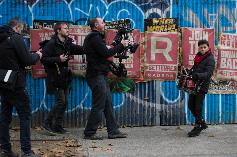
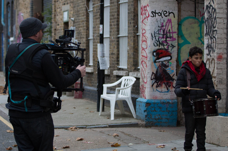
Inciting a rebellion.
Radeon’s new brand identity informed the RX 480 product launch. It was the first graphics card to include high-end features at a low price, undercutting rivals and doing away with many restrictive practices found in the industry. This wasn’t just good for marketing, it was a movement. So we started the Radeon Rebellion.
Our creative strategy positioned the audience as being an ‘oppressed’ people, united by the desire for a better product. In many ways that reflects Radeon’s own position, one of an industry underdog.
We turned the issues of people being priced out of the products into propaganda-style demands such as “VR is not just for the 1%”, echoing existing language used in grass-roots movements.
The campaign was a huge success. The RX 480 sold out globally at launch. Radeon’s year-on-year revenue increased by 28%, its market share increased by 7.1% and the campaign hashtag was used 4.4 million times.


Creating an uprising.
The success of the Radeon Rebellion paved the way for Radeon to announce its new high-end graphics architecture, VEGA. We created a follow on film called After the Uprising, which continued the Rebellion narrative. The film was stuffed with Easter Eggs for fans to find, which would lead them to a website found at ve.ga. The final showstopper was a gigantic room full of drums, which was entirely modelled in CGI. ‘Make Some Noise’ became the rallying cry.


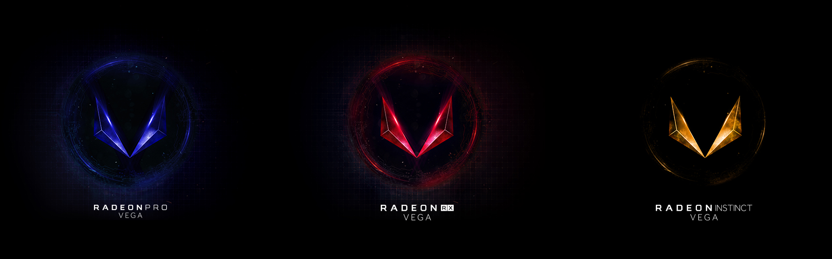
A flexible brand.
The Radeon brand is extremely adaptable and has been applied to products aimed at gamers, creative professionals and corporations. The VEGA ‘V’ symbol was born from the same cube as the Radeon logo and firmly places it within the existing brand portfolio. It’s given much needed cohesion to the company’s offering and helped establish its position in the market.